Composition refers to the way all the separate elements, such as type, grid, images, graphics and colours, come together to form a whole. A well-composed design conveys the intended message clearly and precisely. We’ve explored different frame variants, how type works in different layouts and how graphics complement content in different formations to arrive at the following guidance.
The look of the EO brand is achieved by using a balanced combination of brand elements and establishing strong spatial relationships between all the elements in a layout, including the grid, colour palette and measured use of the signature curve. Subtle touches of the curve carried throughout the brand unify the various products, programmes and offerings across the organization.
Grid
The grid helps lay out a consistent architecture of how various brand assets and components would look and feel, no matter which application they are built in.
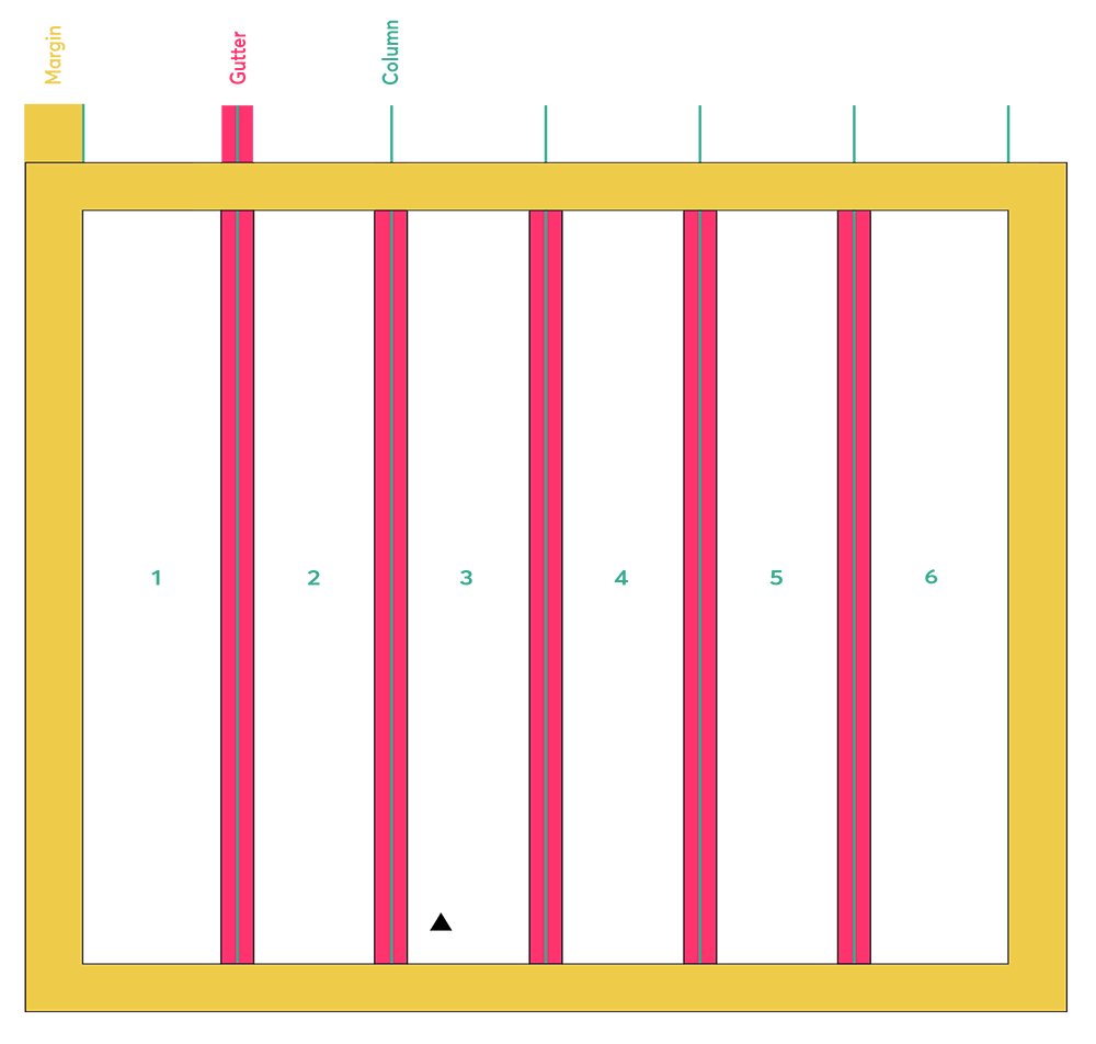
It is a great tool for organizing information and creating hierarchy. Our grid is made up of three elements: columns, gutters and margins.
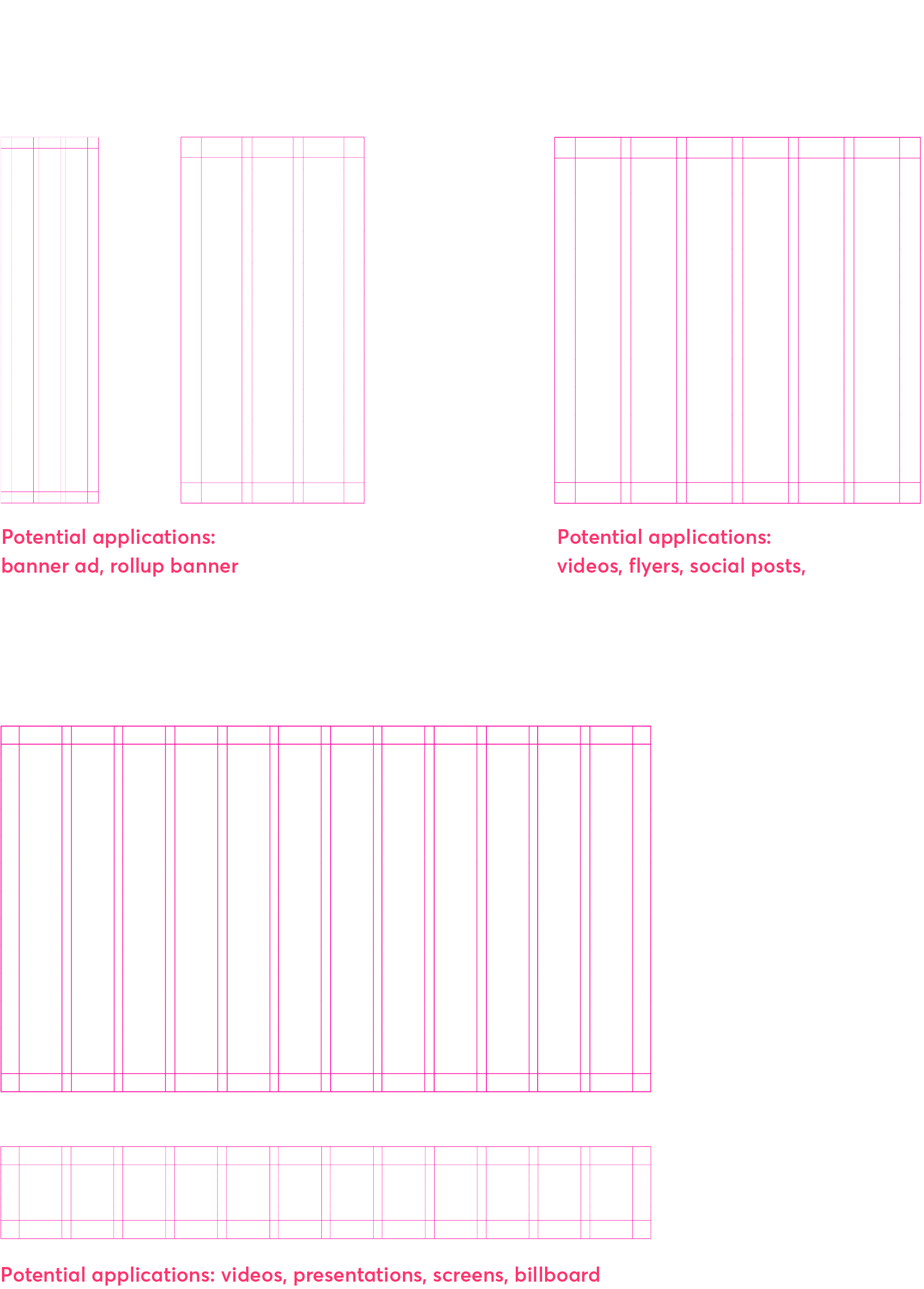
Content is designed in various applications across the organization. These grids have been defined to provide flexibility within a consistent and properly branded framework. Different layouts require different grids. For example, a banner ad requires a 3-column grid. A social post calls for a 6-column grid.
Depending on the dimensions of your layout, you have three grid options: a 3-column grid, a 6-column grid or 12-column grid.
Depending the dimensions of your layout, you have three options to choose from: 3 column grid, 6 column grid or a 12 column grid.
Building your grid
Define columns
Based on the column breakdown, determine the number of columns that makes the most sense for your composition. For a 1:1 format, a 6-column grid works best.
Define margins
Once the columns are established, divide the width of one column into three even parts. 1/3 of the column width = margin and base unit width
Equal margins on all sides
Apply the 1/3-column margin to the top, right, bottom, and left of the composition.
Define gutters
Once the margins are established, divide the width of the margin into two even parts. 1/2 of the margin width = the gutter width.
Apply gutters
Distribute the gutters to form the 6 columns within the margins. The gutter width should be consistent across the composition (Example showing a 6 column format)
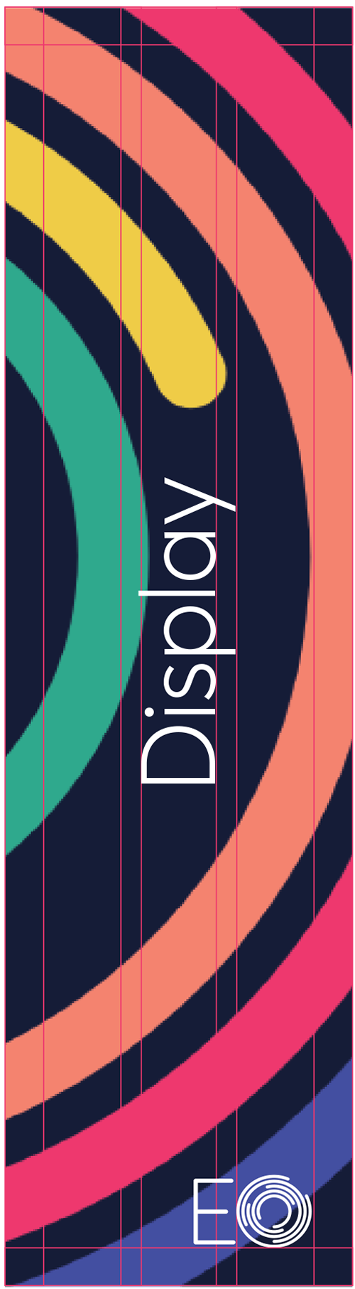
Using the curve
The circular form of the EO logo is an important element of the brand, mirrored throughout the visual expression through consistent use of rounded corners and curved silhouettes. They act as inflections at the intersection of two elements, where colour meets canvas and image meets word. Here are a few guidelines for using the curvature:
- Curved forms may be used to define subdivisions within a layout
- Curved forms may be used to highlight the content and brand, but should not overpower the information being communicated.
- Although the curvature is an important element of EO’s brand expression, sometimes not using it makes more sense for the composition as a whole.
- Avoid overusing the curve within a single composition, as that will diminish its visual impact
- When referencing concentric arcs as a design element that imitates the logo mark, they should be always be shown partially so that they are not mistaken for the mark—whether cropped and bleeding off an edge, or using fewer layers, as shown in the examples below.
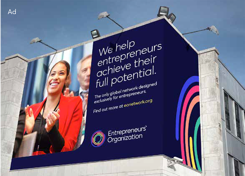
In practice
Here are some examples of compositions that correctly use the curved forms and lines in ways that enhance the brand. All use a collaboration of the following assets: vibrant colours, experiential imagery, curved forms, type and colour blocking.
- Use only vertical and horizontals to anchor your compositions and allow the curved profile to take prominence; no strong diagonals are used.
- Curved lines and forms act as an accent and are to be used judiciously for maximum effectiveness.
- Logos and typography should always be contained within the permitted area for content.
- Imagery and graphics can go “full bleed” to the edge of the page, through the margins.