EO Web Style Guide
This web style guide is a comprehensive overview of all web elements and patterns used for creating web pages and web application at the Entrepreneurs' Organization. This guide serves as a resource to bring together EO web properties to help define their visual and stylistics components. It can also be used as a tool to provide a great starting point for front-end components commonly used by EO web design team and providing standard and principles to follow.
This guide is presented as a single page with navigation to the right that can be used to move into each section.
Logos
The Entrepreneurs' Organization logo consists of the graphic element of "EO," with the orange tachometer, three dots above the "O" and the stacked words "Entrepreneurs' Organization." More information on general brand and print guidelines can be found on the communication resources page. This web style guide focuses primarily on web guidelines, but does include different iteration of EO logo avaialble below.
Primary Logo
Stacked Logo
EO Logo Only


Color Palette
Colors available for designing interfaces are available below. Designs should mostly rely on the primary color palette with secondary and notification colors available to help differentiate elements or give status of interface. Gradient backgrounds can also be used as a main focal point in the layout.
Primary Color Palette
EO Web Orange
HEX #E05B18
EO Web Black
HEX #363636
EO Web Grey
HEX #F0F0F0
HEX #E3E3E3
EO Blue
HEX #007AC9
EO Yellow
HEX #EAAB00
EO Pink
HEX #C50084
Secondary Color Palette
Black
HEX #1E1E1E
Dark Grey
HEX #565A5C
Cool Grey
HEX #BCBDBC
White
HEX #FFFFFF
EO Green
HEX #7AB800
EO Dark Green
HEX #024731
EO Dark Blue
HEX #003c69
EO Dark Red
HEX #822433
Notification and Status Colors
Red - Error
HEX #ee4035
Green - Status
HEX #3bb878
Grey - Secondary
HEX #e9e9e9
Light Orange
HEX #eea982
Light Blue
HEX #92afdb
Light Yellow
HEX #F8de6e
Gradient Backgrounds
Gradient: Blue to Pink
Gradient: Blue to Dark Blue
Gradient: Orange to Pink
Typography
This section briefly goes over font-families and elememt sizing.
Font-Families
4 Iterations of the Futura font-family are loaded into the DOM using CSS3 @font-face.
Futura Light
a b c d e f g h i j k l m n o p q r s t u v w x y z
a b c d e f g h i j k l m n o p q r s t u v w x y z
1 2 3 4 5 6 7 8 9 0
Futura Light Italics
a b c d e f g h i j k l m n o p q r s t u v w x y z
a b c d e f g h i j k l m n o p q r s t u v w x y z
1 2 3 4 5 6 7 8 9 0
Futura Medium
a b c d e f g h i j k l m n o p q r s t u v w x y z
a b c d e f g h i j k l m n o p q r s t u v w x y z
1 2 3 4 5 6 7 8 9 0
Futura Medium Italics
a b c d e f g h i j k l m n o p q r s t u v w x y z
a b c d e f g h i j k l m n o p q r s t u v w x y z
1 2 3 4 5 6 7 8 9 0
Font-Sizing
Font-sizes are relative to the HTML font-size root of 16px or 1em. Paragraphs have a font-size of 1rem.
Sizing for Headers on desktop are H1: 3.188rem, H2: 2.75rem, H3: 2.25rem, H4: 1.75rem, H5: 1.313rem, H6: 1rem
Sizing for Headers on mobile are H1: 2.438rem, H2: 2.125rem, H3: 1.688rem, H4: 1.25rem, H5: 1.063rem, H6: 0.938rem
Heading H1
Heading H2
Heading H3
Heading H4
Heading H5
Heading H6
H6 – Subheader
H5 – Subheader
H4 – Subheader
H3 – Subheader
H2 – Subheader
H1 – Subheader
Heading H1 – up
Heading H2 – up
Heading H3 – up
Heading H4 – up
Heading H5 – up
Heading H6 – up
H6 – Subheader – up
H5 – Subheader – up
H4 – Subheader – up
H3 – Subheader – up
H2 – Subheader – up
H1 – Subheader
Heading and Paragraphs can also have their color property changed by adding classes like .blue, .orange, .pink, etc. There is also a class called subheader seen above that changes color to light grey and adjust the font-weight. Also note that .up class that changes the text to uppercase on an element.
Heading H1
Heading H2
Heading H3
Heading H1 – up
Heading H2 – up
Heading H3 – up
Links and Lists
This section goes over the basic link styles and some styles available for lists.
Basic Links
Links within text are styled in EO Orange Color with no text-decoration.
On dark backgrounds, links should be styled as seen here with text decoration
List Styles
The below classes are used to create style lists that can be used through the interface.
list-angle class
- Ancillae scriptorem assueverit dissentiet
- Vis mutat dolorem referren turtantas
- An exerci dictas quaerendum his nonumy
- Te has dicta audiam maiorum dolorem
- Falli veritus insolens nec ex tantas
list-angle grey class
- Ancillae scriptorem assueverit dissentiet
- Vis mutat dolorem referren turtantas
- An exerci dictas quaerendum his nonumy
- Te has dicta audiam maiorum dolorem
- Falli veritus insolens nec ex tantas
list-angle orange class
- Ancillae scriptorem assueverit dissentiet
- Vis mutat dolorem referren turtantas
- An exerci dictas quaerendum his nonumy
- Te has dicta audiam maiorum dolorem
- Falli veritus insolens nec ex tantas
list-angle-double class
- Ancillae scriptorem assueverit dissentiet
- Vis mutat dolorem referren turtantas
- An exerci dictas quaerendum his nonumy
- Te has dicta audiam maiorum dolorem
- Falli veritus insolens nec ex tantas
list-angle-double grey class
- Ancillae scriptorem assueverit dissentiet
- Vis mutat dolorem referren turtantas
- An exerci dictas quaerendum his nonumy
- Te has dicta audiam maiorum dolorem
- Falli veritus insolens nec ex tantas
list-angle-double orange class
- Ancillae scriptorem assueverit dissentiet
- Vis mutat dolorem referren turtantas
- An exerci dictas quaerendum his nonumy
- Te has dicta audiam maiorum dolorem
- Falli veritus insolens nec ex tantas
list-plus class
- Ancillae scriptorem assueverit dissentiet
- Vis mutat dolorem referren turtantas
- An exerci dictas quaerendum his nonumy
- Te has dicta audiam maiorum dolorem
- Falli veritus insolens nec ex tantas
list-plus grey class
- Ancillae scriptorem assueverit dissentiet
- Vis mutat dolorem referren turtantas
- An exerci dictas quaerendum his nonumy
- Te has dicta audiam maiorum dolorem
- Falli veritus insolens nec ex tantas
list-plus orange class
- Ancillae scriptorem assueverit dissentiet
- Vis mutat dolorem referren turtantas
- An exerci dictas quaerendum his nonumy
- Te has dicta audiam maiorum dolorem
- Falli veritus insolens nec ex tantas
Buttons and Form Components
This section outlines the styles used on interfaces containing forms
Buttons
Simple styles for buttons generally used in three flavors. Orange buttons should be used first as the primary call to action on a page. Dark buttons are used as a second option for a call to action, followed by grey buttons that used if a third differentiation is needed on a page.
Forms
Below you will see some common layouts and patterns used on forms.
Dropdowns
There are some additional dropdown styles that have been included in the interfaces.
JS Components
Below are components that have been created to aid in layout; all of which rely on jQuery
Image Cross Fade
Two Images can be cross fade with each other


Accordion
Content can be group and stored in a collapsable containers
Tabs
Content can be group and contained in clickable tabs
This is the first panel of the basic tab example. You can place all sorts of content here including a grid.
This is the second panel of the basic tab example. This is the second panel of the basic tab example.
This is the third panel of the basic tab example. This is the third panel of the basic tab example.
This is the fourth panel of the basic tab example. This is the fourth panel of the basic tab example.
Modal
Pop-up windows that can be used throughout the interface and customized as needed
Additional UI Components
Indicators
Use to show status or location within interface.
You Are Currently Editing the Page
You Are Currently View this Backend
Pagination
Simple pagination to show page location and ability to move to other pages.
Panels
Used to group and hold content.
Nam eget vestibulum diam. Nullam odio purus, gravida fringilla efficitur sed, porta ut diam. Pellentesque nec odio quis nisl convallis pellentesque nec a felis. Donec vitae pretium augue. Cras felis lorem, commodo at lobortis sed, consequat sed nisl.
Nam eget vestibulum diam. Nullam odio purus, gravida fringilla efficitur sed, porta ut diam. Pellentesque nec odio quis nisl convallis pellentesque nec a felis. Donec vitae pretium augue. Cras felis lorem, commodo at lobortis sed, consequat sed nisl.
Nam eget vestibulum diam. Nullam odio purus, gravida fringilla efficitur sed, porta ut diam. Pellentesque nec odio quis nisl convallis pellentesque nec a felis. Donec vitae pretium augue. Cras felis lorem, commodo at lobortis sed, consequat sed nisl.
Nam eget vestibulum diam. Nullam odio purus, gravida fringilla efficitur sed, porta ut diam. Pellentesque nec odio quis nisl convallis pellentesque nec a felis. Donec vitae pretium augue. Cras felis lorem, commodo at lobortis sed, consequat sed nisl.
Content Blocks
Colorful ways to accent content throughout the interface.
Highlights and Labels
Highlights and labels allow for a way to accent text or create a tag with content.
Text that is highlighted in a nice way.
Text that is highlighted in a different color.
Text that is highlighted in an even different color.
Heading that is highlighted in a light way
Heading that is highlighted in a light way
An Orange Label An Orange Label An Orange Label An Orange Label An Orange Label An Orange Label
A Blue label A Blue label A Blue label A Blue label A Blue label
A Dark label A Dark label A Dark label
Title/Heading with Lines
The title/heading with line style provides a way to create natural divisions within the layout. Below you will see some examples of what is available in the UI.
Title With Line
Nunc bibendum aliquet lectus, vel efficitur dolor scelerisque eu. Suspendisse ut consectetur purus. Maecenas et justo quis eros venenatis egestas a eget ex. Link to Something Nam egestas placerat ex, quis fermentum purus finibus eget. Nulla gravida, libero in dictum mattis, lectus lorem maximus orci, vel condimentum magna ipsum tristique tellus. Nunc aliquam tempor consectetur. Aliquam erat volutpat. Aliquam et leo at ligula accumsan convallis. Donec a viverra nisi. Maecenas gravida, lectus vel venenatis eleifend, lectus urna bibendum risus, vel rutrum arcu diam iaculis libero.
Title With Double Line
Nunc bibendum aliquet lectus, vel efficitur dolor scelerisque eu. Suspendisse ut consectetur purus. Maecenas et justo quis eros venenatis egestas a eget ex. Link to Something Nam egestas placerat ex, quis fermentum purus finibus eget. Nulla gravida, libero in dictum mattis, lectus lorem maximus orci, vel condimentum magna ipsum tristique tellus. Nunc aliquam tempor consectetur.
Title Just Center
Nunc bibendum aliquet lectus, vel efficitur dolor scelerisque eu. Suspendisse ut consectetur purus. Maecenas et justo quis eros venenatis egestas a eget ex. Link to Something Nam egestas placerat.
Title Just Center
Nunc bibendum aliquet lectus, vel efficitur dolor scelerisque eu. Suspendisse ut consectetur purus. Maecenas et justo quis eros venenatis egestas a eget ex. Link to Something Nam egestas placerat.
Title Just Center
Nunc bibendum aliquet lectus, vel efficitur dolor scelerisque eu. Suspendisse ut consectetur purus. Maecenas et justo quis eros venenatis egestas a eget ex. Link to Something Nam egestas placerat.
Quotes
Used to treat a quote.
I love EO! Not only am I surrounded by entrepreneurs with plenty of experiences to share, but the global-networking opportunities and exposure for my business are priceless!
Reghard Goussard
EO South Africa – Cape Town
Icons
Font Awesome Icons can be used through the interface.
Layout and Data Display
Grid
The EO UI utilizes the Foundation 5 grid system that allows for a 12-column layout that works across all devices and can be nested. Simple examples can be seen below; classes can be applied to allow for very complex layouts in standard 12 column fashion. Columns can be defined for large, medium, small layouts. Also centered columns, collapsable rows, and incomplete rows can be used to aid in layouts.
Block Grid
Block grid allows you to create continuous rows of content that can be evenly spaced and in different numbers based on screen size.
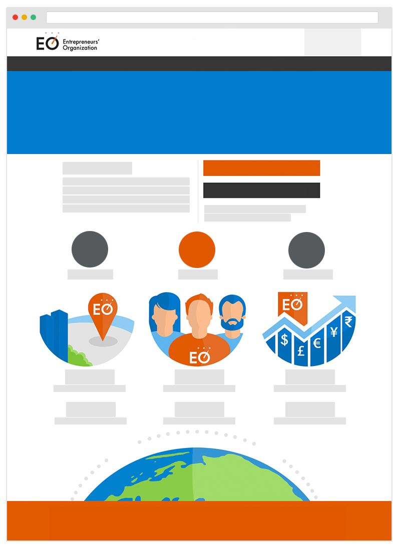
Hero Banner
Generally used at the top of a page under the navigation. The image below show a grid used to help design the banner.
Hero Banner
Displayed @ 1600 x 280px
Created @ 3200 x 560px for Retina
Viewable Width @ 1000px / 62.5em
Side Navigation
A side navigation can be used to create a secondary navigation within a sub-site. The styling for a side nav can be seen belo for both the left and right sides of a page.
Side Nav Left-Side
Title of Fake Content
Suspendisse sit amet urna congue, sodales lorem vel, venenatis est. Nunc sed cursus sem. In neque lectus, posuere non porta id, ullamcorper eget lorem. Morbi vitae nibh est. Morbi sit amet nunc eu turpis sagittis faucibus. Sed ut tincidunt dolor. Maecenas tincidunt turpis sit amet aliquam aliquam. Nulla facilisi. Quisque sollicitudin auctor enim vel venenatis. Proin massa quam, fermentum vitae convallis ornare, viverra vel mi. Proin dapibus, nibh consectetur laoreet suscipit, augue tortor elementum eros, vitae rutrum erat augue vel leo. Sed ipsum augue, mollis ac ipsum a, ultricies maximus massa. Nullam commodo arcu a dui facilisis viverra. Mauris aliquam dolor sem, ut pellentesque neque pretium in.
Side Nav Right-Side
Tables
There are style available for tables.
| Column Heading | Column Heading 2 | Column Heading 3 |
|---|---|---|
| Some Content Here | Some Content Here | Some Content Here |
| Some Content Here | Some Content Here | Some Content Here |
| Some Content Here | Some Content Here | Some Content Here |
Data Item Lister
Useful as a replacement for tables or modular data in admin/backend views.
Item
Person
Actions
Some Item
Some Person
Some Item
Some Person
Some Item
Some Person
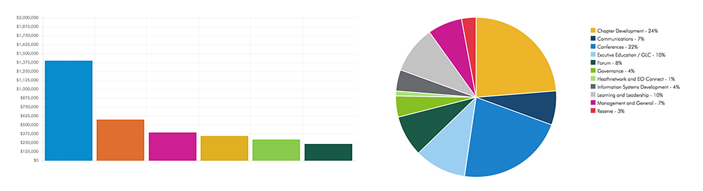
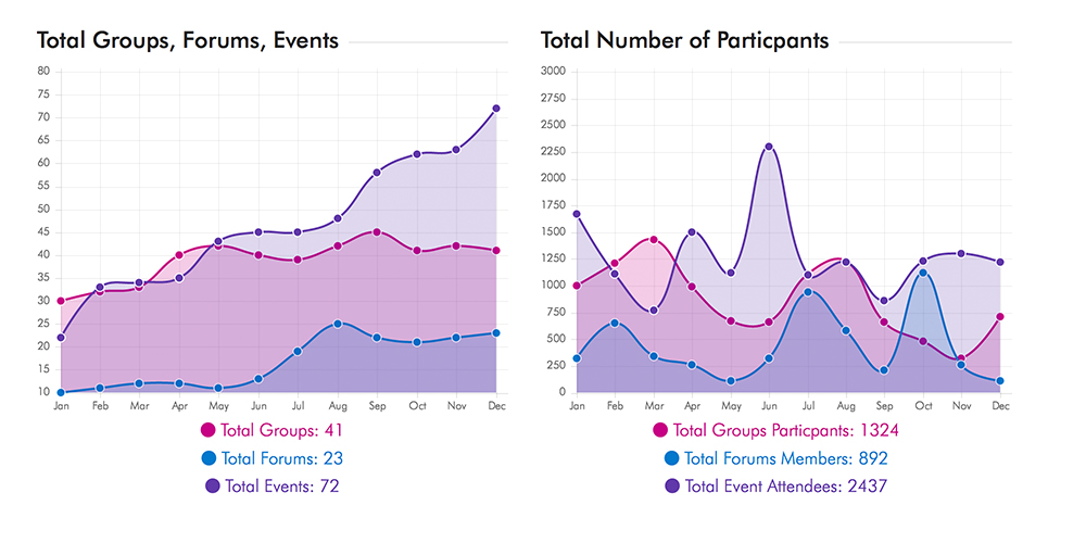
Graphs and Charts
CSS and JS used to construct graphs and charts on EO web platform is not included in the base components. Below you will find image captures of charts that were built for EO web projects utilizing CSS/JS.