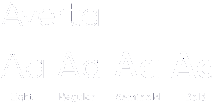
Typography is one of the most widely-used tools of all the brand elements. The Averta font was chosen for its unique, simple, legible and open qualities.
Primary design font
Averta should be used for all materials created in design programs (ie, Sketch, Adobe Illustrator, Adobe InDesign, Adobe Photoshop, Quark, etc.)
Because chapters are individual legal entities in local jurisdictions, Averta is not licensed for usage across chapters globally. Averta PE (Pan-European) is what we use globally to cover all languages. It is available for purchase here. The basic version of Averta, Averta Standard, may fit your needs at lower cost. These links are provided as a resource for chapters, members and partners to purchase Averta for creation of branding and marketing materials; EO is not affiliated to MyFonts.
System fonts
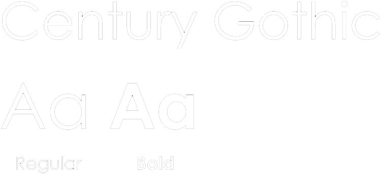
While Averta is our main brand font, Century Gothic and Arial are our supporting system fonts. They come standard in Microsoft Office. In situations where Averta is not available, use Century Gothic as an alternative when sharing projects/documents in Microsoft Powerpoint. For Microsoft Word and Excel projects/documents, and for emails, use Arial in primary body text for legibility and accessibility and Century Gothic for headings, subheads and call-outs.
Hierarchy
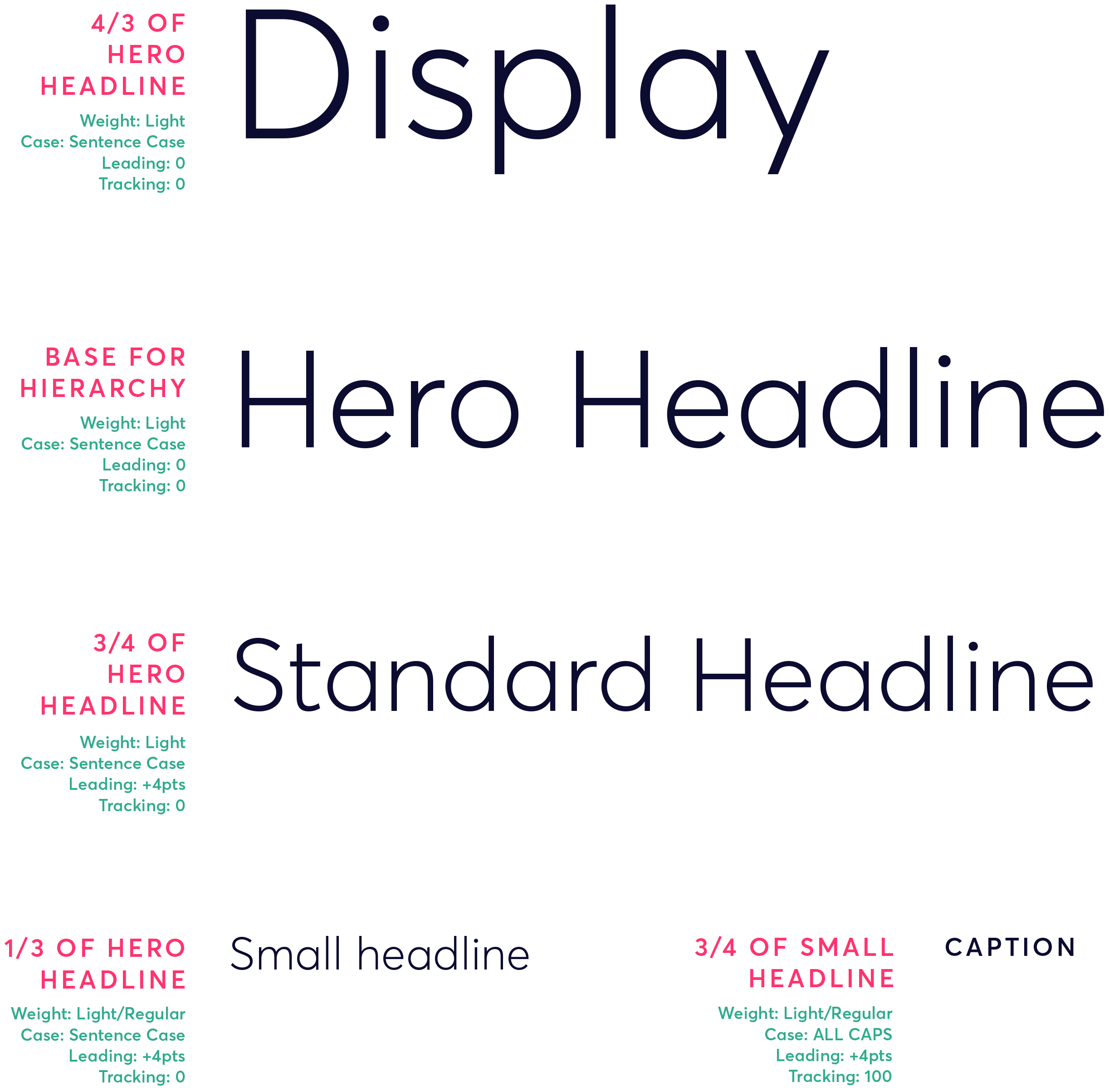
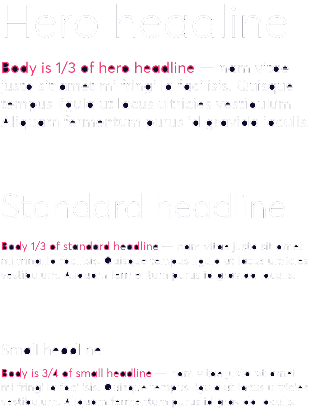
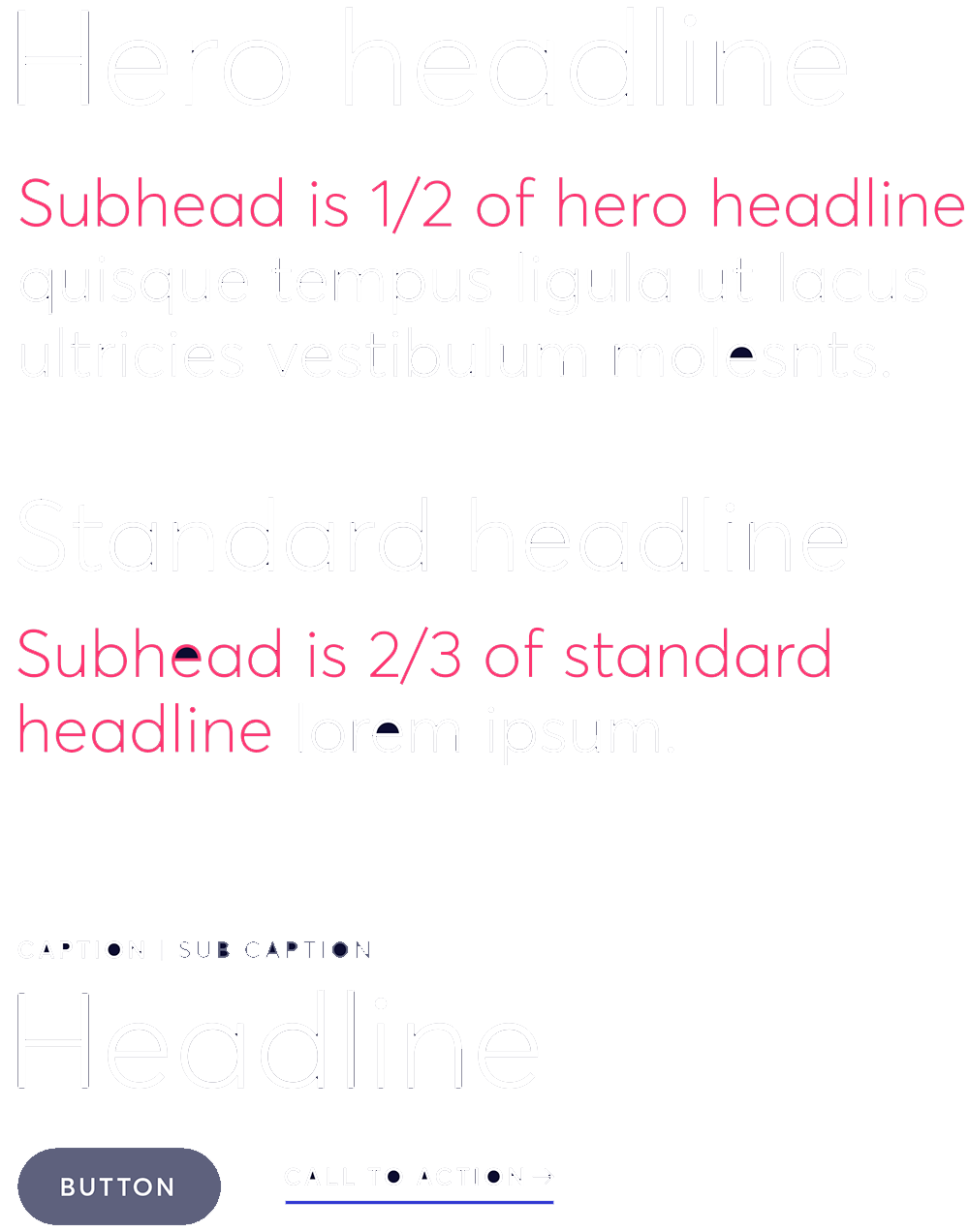
It is important to utilise hierarchy to convey relative importance and guide the audience through a communications piece. Hierarchy is achieved through differences in font weight (light, regular, semibold, bold), size, letter spacing and case.
This example type scale uses the Averta typeface for all headlines, subtitles, body text and captions. The same scale can be accomplished using Century Gothic is Averta is not available. To create a consistence typography experiences, avoid mixing Averta and Century Gothic in the same document.
Other notes for effective typography:
- For better legibility, avoid setting large amounts of text in colour. Instead, use colour in typography to accent or draw attention to specific content.
- Body text should always be set in sentence case. Setting large amounts of text in all caps inhibits readability.
- Print type sizes should not be smaller than 8 pts.
Use the following examples as a guide to help you determine what hierarchy works best for any application.
Translation
In order to maintain and promote a consistent brand experience across all the various languages and cultures which comprise the EO community, please adhere to the following guidelines when creating translated documents.
Averta is the external brand typeface and design font of EO. Therefore, all Latin and Arabic alphanumeric words, characters and glyphs should be set in the appropriate corresponding weight in Averta. When using non-Latin fonts, do not use the default alphanumeric glyphs that accompany the Chinese, Japanese and Korean (CJK) or non-Latin font; rather, manually replace them with Averta’s glyphs.
CJK, Asian, Brahmic, Arabic and other non-Latin text should be set in a native gothic typeface comparable to the look and feel of Averta: sans serif, even strokes and simple geometric forms. For most other languages, use Averta, as it was chosen specifically to cover all required Latin, Greek and Cyrillic characters.
Best practices for multilingual typography:
- Whenever possible, keep all punctuation equivalent to and consistent with that of the original English version, unless it alters the meaning or breaks conventional language/grammar rules in the translated language.
- When translating special text, i.e. titles of books, quotations or references, match formatting to the style guidelines of the translated language. For example: in English, the title of a book or publication is italicized, Title of Book. The translated book title would be stylized, 《书名》.