EO’s logo is a symbol of who we are and what we do.
The concentric lines of the logo illustrate the nature of the relationships that EO members build. The lines are interacting and influencing one another, connecting together. At the center of the mark is our member, the heart of who EO is.
Logos and assets now available
User login/authentication required
Visit EO’s communications resources page to access our logo files, EO chapter logo files, as well as other print and digital templates. Get started on your local implementation of the new EO brand!
If you are an EO partner needing logos and appropriate assets, please reach out to your EO contact for access. EO members and staff working with a third party vendor should download the assets and forward them directly to the vendor.
How to use the EO logo
When you’re designing communications, templates and graphics for EO, it’s essential to understand the elements of our brand identity. Let’s begin by exploring our logo.
Please treat our logo with respect. Avoid customizing it or reconfiguring it. The rules outlined are designed to support the integrity of our logo and our brand.
Primary Logos
There are different configurations of the logo for you to choose from. As you build communications, you may use the one that best fits your space requirements.
A few rules:
- External communications should always use either the “primary logo” or the “stacked logo” and should always contain our full organization’s name (“Entrepreneurs’ Organization”) alongside the mark.
- The “short logo” is to be used only after the full EO logo has been introduced first. It is mainly intended for internal use. It should only be used externally when used together with the primary or stacked logo. Our logos CANNOT be modified under any circumstance without permission.
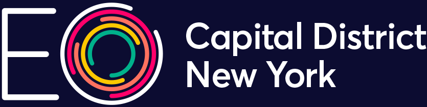
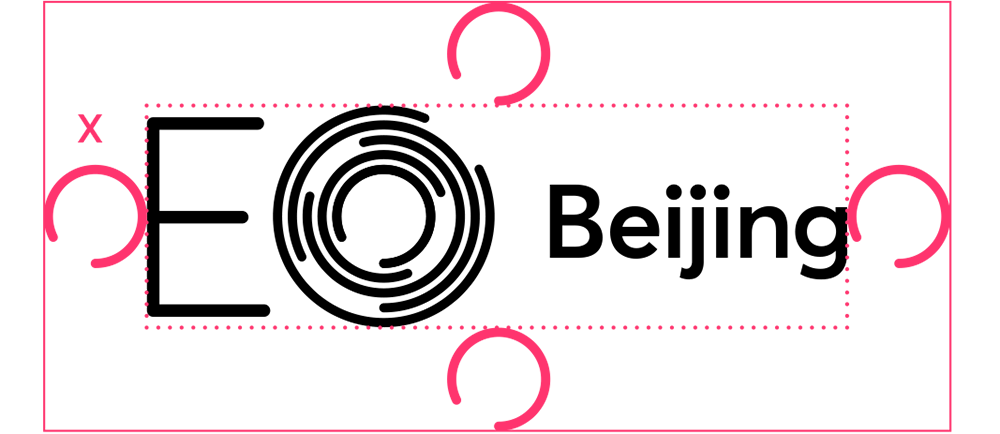
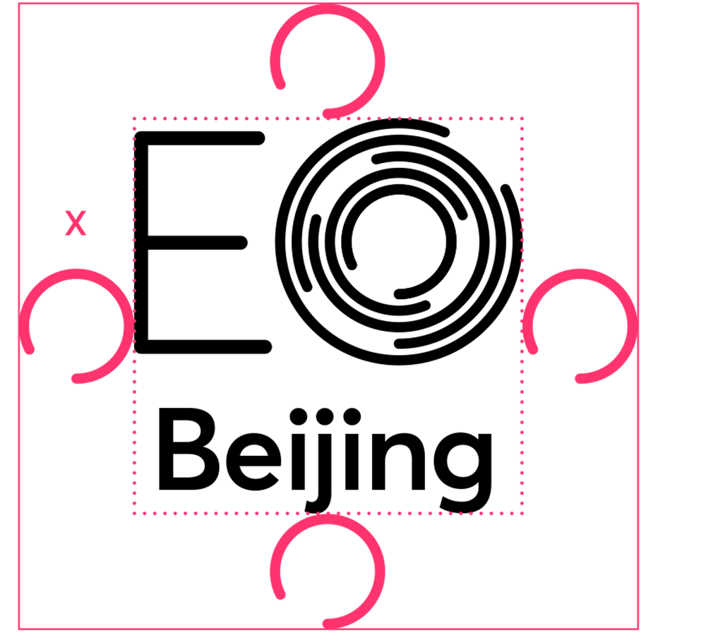
Chapter Logos
Our chapter logos feature EO’s short logo and the chapter’s name. Chapter logos are available in both “primary chapter” and “stacked chapter” configurations. Use the listed configuration that best fits the space available on the composition.
Download your chapter logo here.


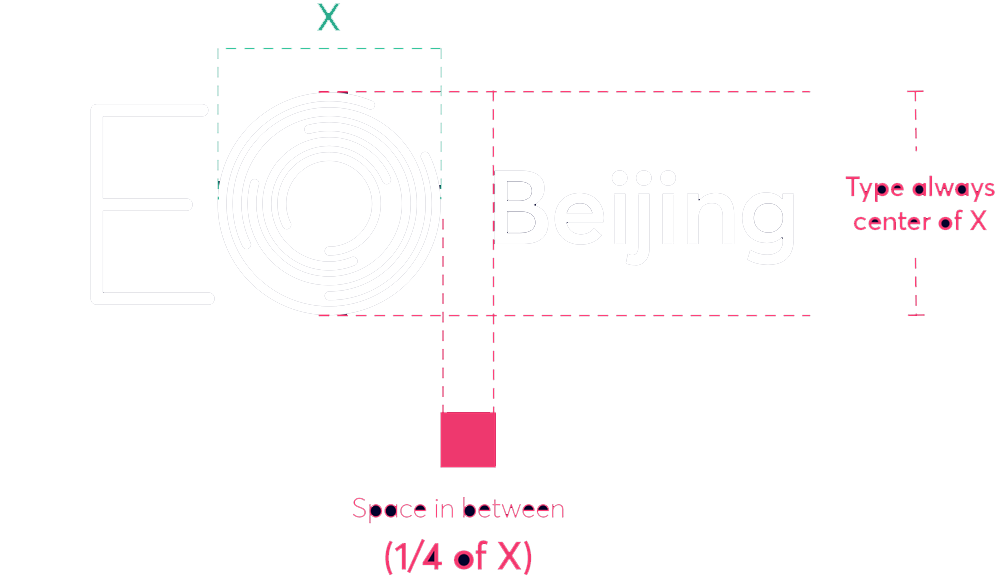
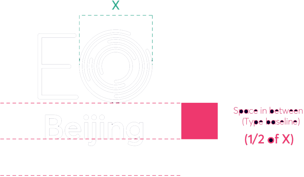
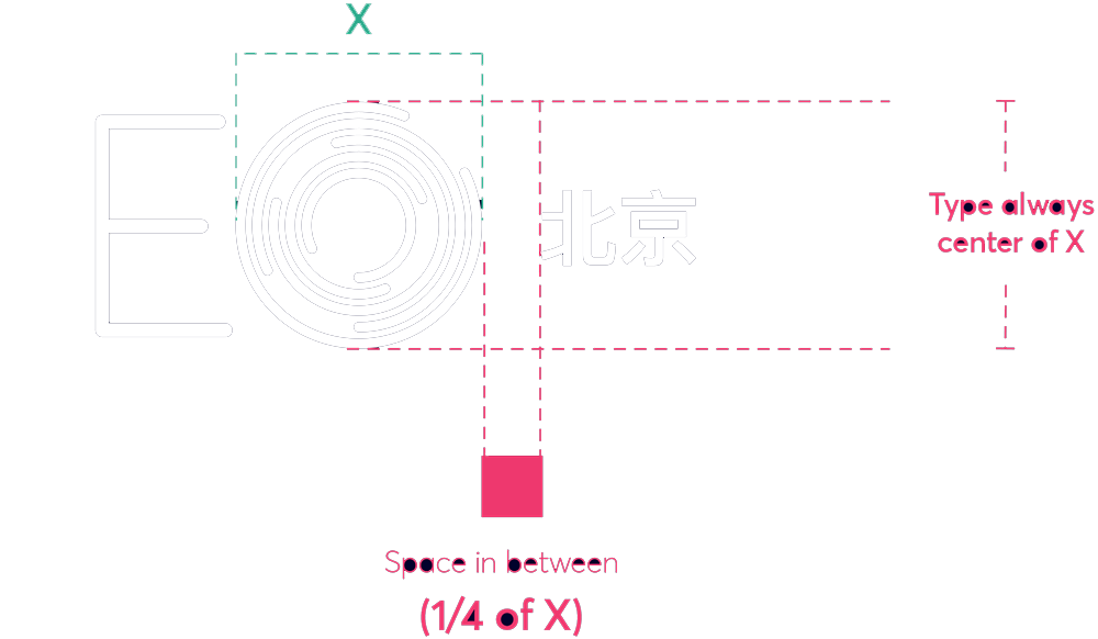
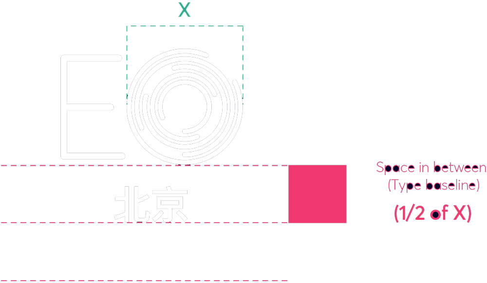
Chapter Logo Structure
Our chapter logo variations as follows:
If chapter name is 11 characters or less, the cap height should be 1/3 of X.
If chapter name is more than 11 characters or has more than two words, the cap height should be 1/4 of X.
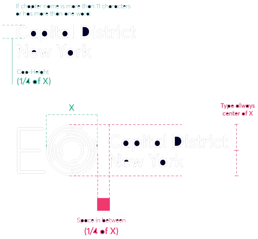
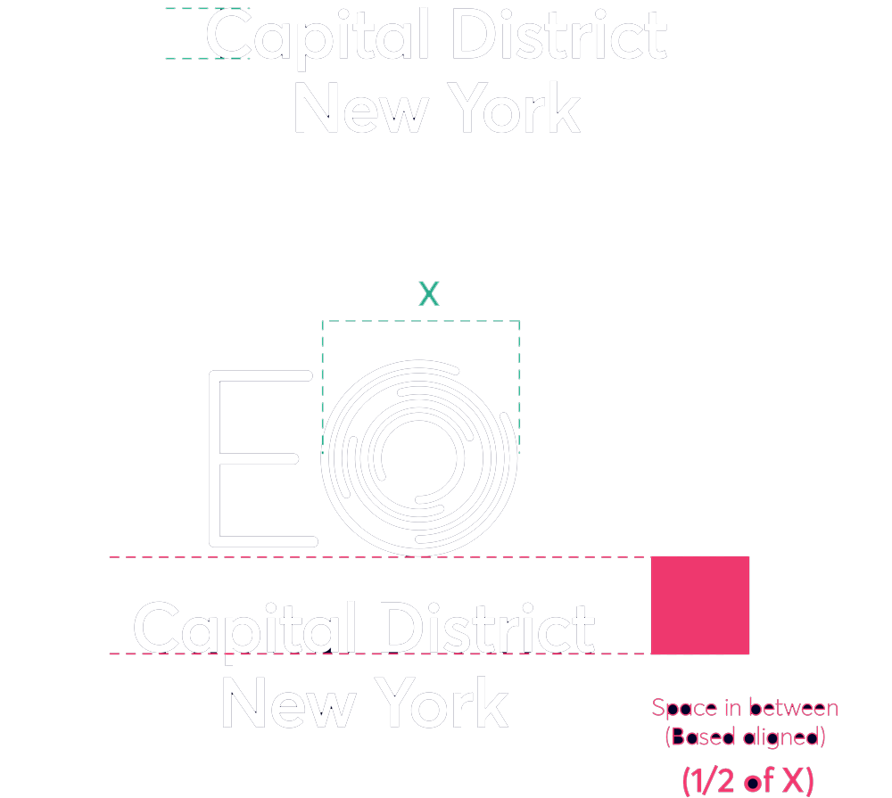
These rules apply whether your chapter logo is written in English or any other language.


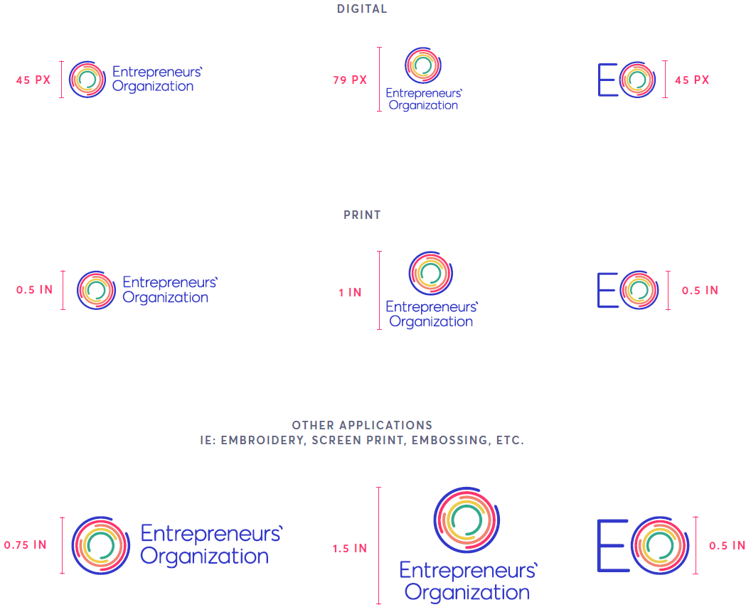
Minimum Sizes
When using the EO logo, please adhere to the following minimum sizes noted on this page. These have been set to ensure that our organizations brand is clearly visible.
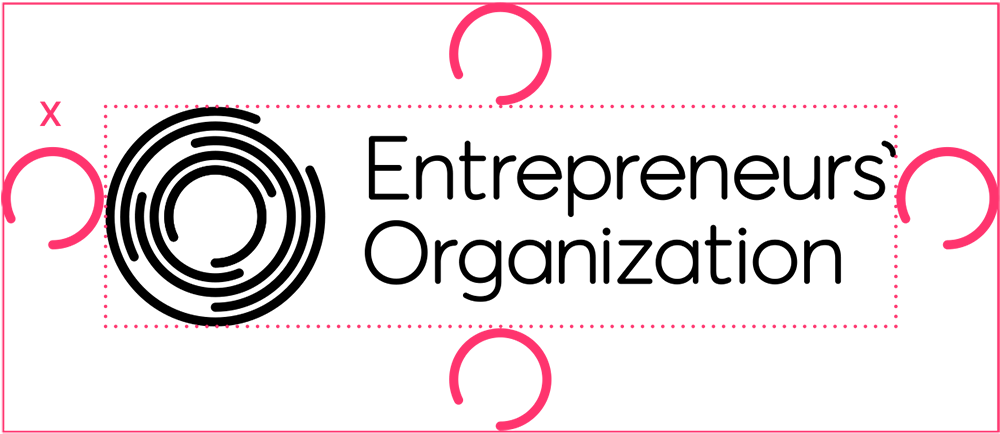
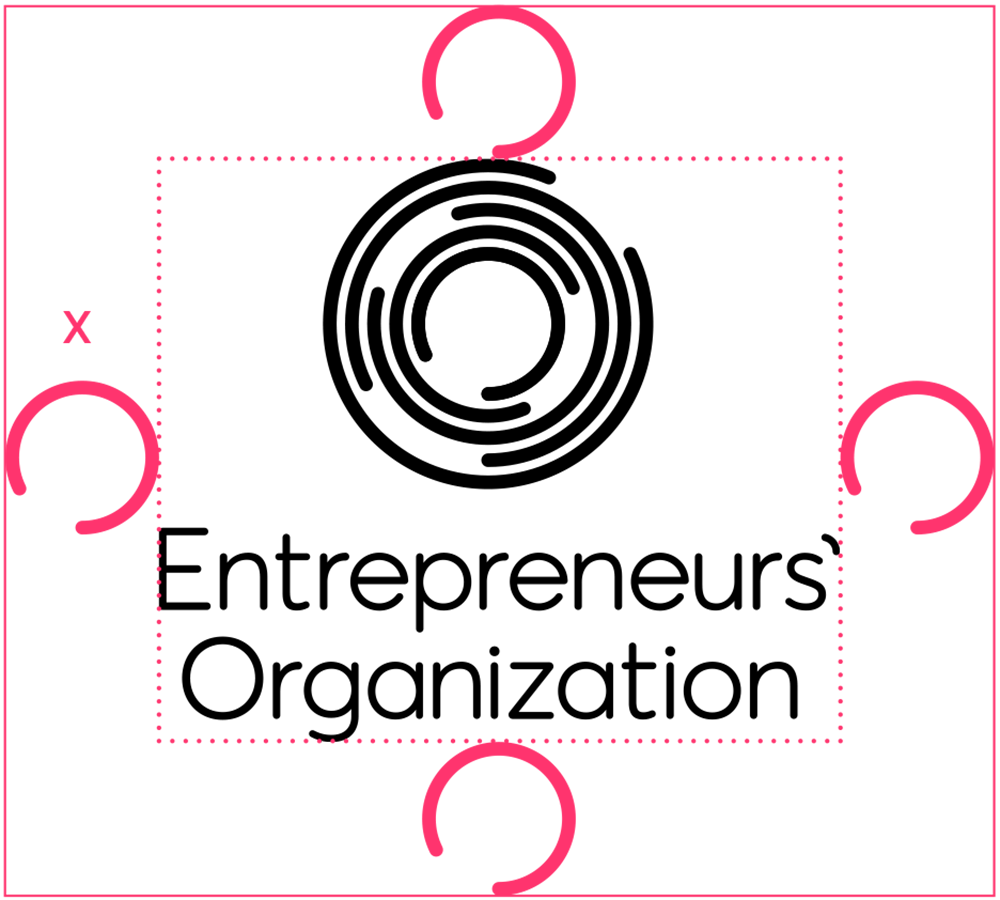
Clear Space
To make sure the logo is legible, it must be surrounded with a minimum amount of clear space.
This isolates the logo from competing elements, such as photography, text or background patterns that may detract attention and lessen the overall impact. Using the logo in a consistent manner across all applications helps to both establish and reinforce immediate recognition of our brand. The above clear space applies to all versions of the logo.


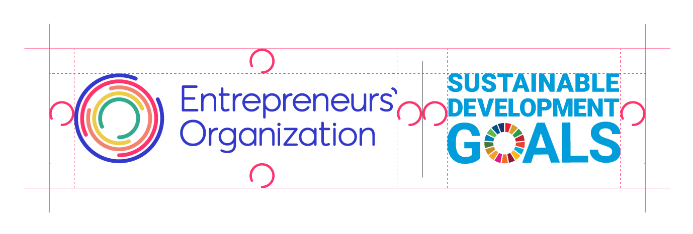
Co-branding
When pairing the EO logo with external partner and sponsor logos, follow the logo usage and clearspace rules as outlined above. Sometimes, a subtle divider line may be necessary for clearer distinction between the EO logo and other logo(s) on the composition. Partner/sponsor logos should always be equal to, or smaller than, the EO logo on the same composition.
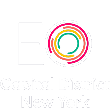
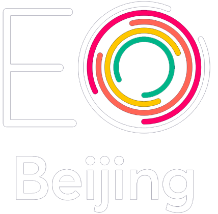
Incorrect Uses
To maintain a consistent experience with the logo, please follow the provided guidance when using the EO logo and/or your EO chapter logo.

Don’t remove or change any elements of the logo.

Don’t use bevel or emboss effects on the logo.

Don’t present the logo on low contrast or similarly-coloured backgrounds.

Don’t put a white box around the logo when placed on a dark or busy background.

Don’t recreate elements or replace them with something else.

Don’t rotate the logo’s orientation.

Don’t change the logo’s colours.

Don’t present the logo in an “outline only” fashion.

Don’t reconfigure or change the size or placement of any logo elements.

Don’t change the logo font.

Don’t place the logo on a busy photograph or pattern.

Don’t add “glow” effects to the logo.

Don’t add “drop shadow” effects to the logo.

Don’t distort proportions by stretching or squeezing the logo.

Don’t crop the logo in any way.

Don’t use the logo or circle mark to represent a zero (0), letter O or any other circular form.